Showing posts with label abstract art. Show all posts

Wednesday, November 17, 2010

Art League of Houston exhibition

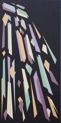
Untitled #3

Untitled #3

Acrylic on canvas, 24" x 48"

©2010 Caroline Roberts


I am excited to announce that two of my paintings, Untitled #3 (shown above) and Untitled #2, have been accepted into the Art League of Houston show, "Gambol", which opens this Friday. I'll be there and I'd love to see you! The opening is from 6 to 9pm at the Art League on Montrose, next door to Texas Art Supply.

I blogged about the creation of Untitled #2 in these three entries:
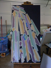
Untitled #3, work in progress day 1
Work in progress, day 2
Untitled #3, completed

Of course I'm not just resting up, thinking about the opening or planning for the holidays. Untitled #5 is on the easel - I'll post some work in progress photos this week - and Untitled #8 has been stretched and is in the process of being gessoed. Okay, that's not happening right this minute as I type (that would be messy!) but I will be finishing that up today.

Thursday, September 2, 2010

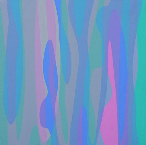
Untitled #2 - the finished painting

Untitled #2

Untitled #2

©2010 Caroline Roberts

24"x24" acrylic on canvas

Ta-dah! I managed to stop before I got perfectionist and started fussing about edges being smooth to the molecular scale. It's a fine line (bad pun intended).

I started the next painting, excitingly titled "Untitled #3" - bet you didn't see that one coming. I pretty much agree with Rauschenberg that paintings are like children: you have to name them something. The trouble is choosing a name that leaves the viewer to interpret as they wish. "Untitled" seems so much less intriguing than, say, "Ortho" , or even "Fred".

However, I am now going to scrap that new canvas and start again. It took a bit of soul-searching to decide that, after all, several hours went into laying it out and blocking in some colors. But in the end I believe it will pay off.

Unfortunately I decided to try and reuse a canvas and the uneven layer of paint is preventing me from achieving the smooth surface and lines that I want, despite sanding and gessoing. The brush sticks and drags as it goes across the old paint in an annoying way that doesn't happen on a nice, fresh canvas. Luckily, since I stretch my own it will "only" involve pulling the old canvas off (embedding a few staples in fingers as I go) and stretching a new canvas onto the bars.

Really, it's for the best. Now I know not to reuse canvas for these flat planes. But will I ever learn anything without making a mistake first?

Saturday, November 14, 2009

Slow Paintings

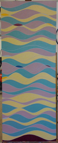
Phases

©2009 Caroline Roberts

This week was one of the most productive studio weeks I have had in a long time. Phases, pictured left, has taken nearly 8 months, but it is finally complete. You've heard of slow food and slow homes? Well, now I must announce: slow painting. Slow more due to insufficient planning. I learnt a lot from this painting - how I have to plan very thoroughly if I am to free-paint such hard edges. Having to repaint the grey lines (they were once blue) and two of the three curve colors didn't help things along. Anyhow, 'tis done and I am really pleased with it.

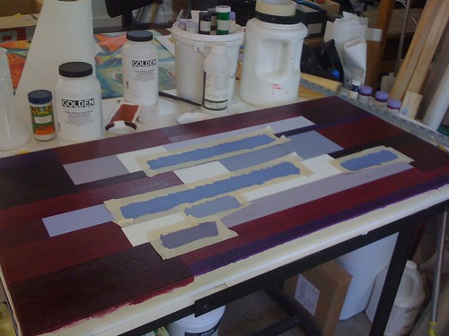
Wind Chimes (work in progress)

©2009 Caroline Roberts

Also on the go this week has been Wind Chimes, shown below. This piece was planned in a lot more detail and is taped which has sped things along. I can't wait to see it finished - removing the tape each time unveils a little more of what it will be. The tape helps the painting guard its secrets for longer and even I only get glimpses.

Today I spent some time tidying the office. I love Marianne's idea of a time-lapsed transformation so I shall post a photo of the beginnings in the next day or so. Right now the floor is the staging area for my daughter's party tomorrow.

Thursday, March 12, 2009

Art Expo - what a crazy day!

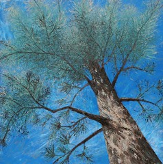
Pine Tree

2007, Caroline Roberts, 36"x36"

Today I was at the Art Exposition at my son's school. My head is reeling. Four hours sitting at a table talking to elementary age kids about my art. I had an hour to set up and then barely a break all day. Chatting to those kids was so much fun - there were several groups that I had really interesting conversations with. Several of the third and fourth graders really seemed to 'get' the idea of abstract art and I had a long chat with one guy who looked like his mind exploded when we discussed how the simpler paintings were harder to do! Seeing a lightbulb go on inside someone's head is just amazing, maybe I should do some teaching?

I wrote and printed up 100 copies of a newsletter and handed out every single one. While I was at the expo I noted down a few things that I learnt for next time:
- I need more handouts, maybe even postcards, the kids love to get "stuff".
- Have some small paintings on the table: everyone looked at the table before they looked at the backboard where the paintings were hanging.
- The Moms that lead the kids round have a definite bias to the jewelry tables. Not sure how I can compete there!
- Tables where there were demos going on were popular. Maybe I can do some actual painting next time.

Things I did that worked well:
- I had sketchbooks and larger color studies on the table and I found that kids and adults alike were interested to hear how I worked on ideas. So many people think we just walk up to a blank canvas and paint.
- Kids love to be asked about their favorite things to draw and their favorite colors.
- I let them touch some color studies and one painting and they loved this. Next time I shall bring small color studies with loads of textures - the showy stuff is fascinating to them.
- the business cards with different paintings on them. Was so glad I didn't use any of my old vistaprint ones when I saw several of the other exhibitors with standard vistaprint cards.

I'm proud of myself for just getting there and having a newsletter and business cards - there's been so much sickness in our house the last month. My son and I have coughs that have led to infections and asthma, so I also have continual jitters from the albuterol. I am so glad that spring break starts tomorrow for us and I have a week off. New York here I come! Really. I am so excited... I am going to try posting by email but who knows if I'll manage to get photos as well as text? This will be one big, fun experiment!

Tuesday, February 24, 2009

A Phase painting in progress

Small section of Phase I

Yesterday I had five whole, uninterrupted hours in the studio. Fantastic. Forgot to eat of course and only stopped when my head went all dizzy. I started a 20" by 50" painting inspired by the music Piano Phase by Steve Reich. A group of three curves is altered in 2 ways - proximity and curvature - in an out-of-phase manner - one goes through 2 cycles, the other 3, over the length of the painting. Perhaps not entirely unexpectedly, if I think of sound waves, this sets up an interference pattern - a pattern within a pattern. So the color order is based on this interference pattern - 3 colors can be arranged in 6 different ways and there were 6 combinations of proximity and curvature, including the base combination.

The above photograph is where I had to stop. The ultramarine is the ground which will show through the colors to a degree. I do not want this to be a flat 'pattern' - I want it to look hand-crafted and to have a little depth. So no tape or flat paint here, although Illustrator was employed as a design tool.

Painting the underlying curves

Yes, in this shot the canvas is awful slack. I made this canvas myself - the first time I've made one this big and awkwardly shaped, but I had a very specific size in mind for the piece. I did cheat and use pre-primed canvas - I really did not want to spend a couple of days just priming. Spritzing the back with water soon had that canvas nice and taut though. A little more practice and I'll get it right.

I had a week blissfully clear of appointments and non-studio stuff and what happened? My son got sick. Some kind of virus that's really just a cold but comes with a fever that spikes on and off for, wait for it... FIVE days. Just as I was thinking I should take a look at all those doors that opened but I haven't walked through yet. So, Universe, what is it now? I was going to call a few of those people I should have called long ago: and now? Maybe tomorrow he'd like to sit on the studio sofa and draw while I get some painting done.

Still, have finally decided that my daughter will go to the pre-K program at the public school from the fall. Some part of me gave up feeling bad and selfish because I want that extra time. Hey, if the worst-case scenarios come true it will be handy having them on the same schedule, and the same if best-case scenarios come true. Like I get enough customers for my paintings that I need to paint more hours to keep up with demand. A girl can (and will) dream!

Somewhat linked to that dream I have another goal for this year:
Actually label and file away expense receipts as they happen, keeping some kind of rudimentary accounts spreadsheet.
Yep, I thought about doing that all this year but when I came to do my taxes... yes, you guessed it, no receipts in the folder. Even if sales don't pick up because of the recession I can at least make good paperwork habits.

Tuesday, January 20, 2009

Geometric Abstraction - part 2

Shards

Some time ago I posted about a large (22" by 48") geometric abstraction I had been working on. By calling that blog entry "part 1" I pretty much promised you a peek at the finished results and here they are. This painting took hours of painstaking work with taping then layer after layer of paint to get a beautifully smooth, opaque color. It is finished with a matte varnish to give the paint a chalky look which I love in these very opaque tints.

To summarize the process, in case you're interested in doing something similar and giving yourself a headache:
  1. designed painting in Illustrator, working from an initial photo and color studies
  2. painted colored ground
  3. measured and taped outside of shapes (where 2 overlapped - minimizing measuring and taping)
  4. used matte medium to seal the tape edges (2 coats)
  5. used gesso on inside of shapes for a nice, white ground
  6. added tape to define individual shapes, using matte medium to seal new edges
  7. painted each shape (with fluid acrylics) multiple times to achieve an opaque, smooth surface
  8. changed tape location and repeated above 2 steps as necessary
  9. pulled off tape and touched up edges
  10. matte varnish

Shards (in progress)

Here it is in progress with the tape still on. As you can see it was very hard to judge how the final piece would look and I did have to repaint some areas to balance the colors and composition after I took some of the tape off. Taking all the tape off was indeed a magical moment as the painting appeared. Despite my careful taping and sealing using matte medium I still had to touch up some areas where paint or gesso had leaked under the tape. Saying that though, I really enjoyed working on this painting - I learnt a lot about how difficult seemingly simple things can be. It also felt meditative to work on such a carefully planned piece. I will probably work like this again, although perhaps not so large or so complex. If I did I would only complete around four a year - that would be four VERY expensive paintings a year. And would be a nightmare to live with.

I love this painting and something about working this way appealed to me - I just have to find out exactly what. Every class I have taken at Glassell has pushed me to try something I would not otherwise have done - a technique, a genre, a subject - sorting out the personal wheat from the chaff is my ongoing homework.

Saturday, November 29, 2008

Geometric Abstraction - part 1

Geometric Abstraction started in the early 20th century with artists such as Wassily Kandinsky and Kasimir Malevich. It is an art based on simple geometric forms - an art of pure form with no emotional content from the artist.

My Take
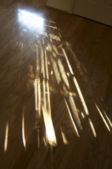
In my course on abstract art at Glassell, one of my assignments is a geometric abstraction. The piece I'm working on was inspired by the light patterns coming through my front door one morning. I was about to rush out the door so I grabbed my camera and took this photo.

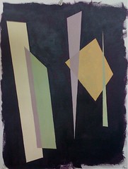
I used Illustrator to trace some of the shapes using the pen tool. It reminded me strongly of light streaming in through a stained glass window so I went with that feeling but with a dark purple ground in place of black. Using that purple as my starting point I played around with the light colors. After a few hours of happy color mixing and recording I came up with a diaz. purple, nickel azo gold, pthalo green (blue shade) combination that gave me these fabulously complex colors I used in this color test piece.

The next step was to paint the final canvas with the purple ground. It took me a couple of sessions and several glazes to be happy with the color. This had to be it because there is no going back once the taping starts!

Oh yes. Taping. I hate taping. But at least these are straight lines. My previous taping experience was with curves and did not work out so well. In this painting though I think perfect straight lines are called for. I tried hand painting in the color trials and I could spend as much time tidying up edges as I might spend applying tape.

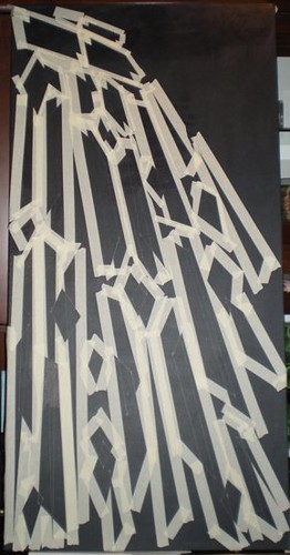
In fact, the taping turned out to be bigger and scarier in my mind than it was in reality. It took me a total of 7 hours to measure, rule and tape the entire 24" by 48" canvas. Thank goodness for the measure tool in Illustrator is all I can say. About 3 hours in I realized what Arielle really meant by a "kick-ass" painting! Here it is after the taping. Once that mammoth task was done I was excited to get moving again. I have sealed the tape in with two coats of matte medium (in the hope that this will stop paint from seeping under the tape) and applied two coats of gesso so my light colors will glow. If I had not used tape painting 2 coats of gesso and then color would have finished off my tiny supply of patience.

Friday, November 21, 2008

Tina Mammoser's Work in Progress Series


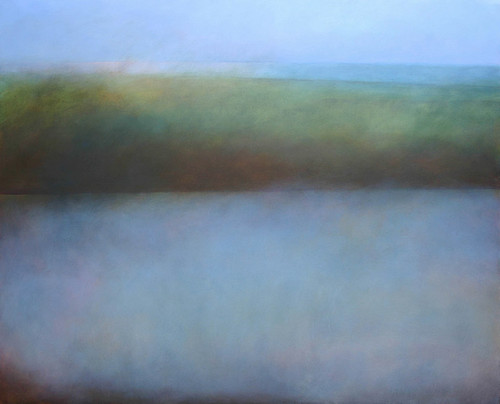
Thornness Bay, Low Tide, originally uploaded by tina-m.

Tina Mammoser, whose artist blog I follow, is running a series of blogs about a work-in-progress that I'm finding fascinating. I love reading about how other people put their paintings together, especially ones as beautiful as Tina's. This is the canvas the series is about - Thornness Bay, Low Tide.

So far Tina has blogged about:
- Source and preparation
- Underpainting
- Midlayers of color

I can't wait to see the post tomorrow about the final glazes. I've found this series very inspiring!

Friday, November 7, 2008

Color, beautiful color

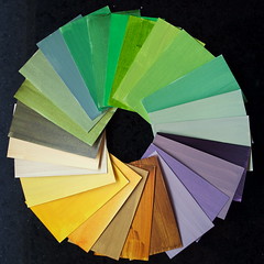
I thought I'd share something my painting tutor, Arielle Masson, spoke about in our class this week. We were discussing ways to choose colors to use in an abstract painting and she told us about the color cards she has made for herself. She uses business card sized pieces of card and paints various mixtures of her paints on them - noting the mix on the back so she can replicate it. Then, when she needs some color inspiration she spreads out the cards and tries out different combinations.

I spent a happy morning mixing colors and painting the backs of old business cards and here are the results!

I found some beautiful colors just from taking one mixture and thinking "What would happen if I added...". Some colors have 3 to 4 parent colors, not including titanium white. I'm going to continue this exercise any time I'm working.

Monday, October 27, 2008

Starting a Series

For some time now I've been wanting to work on a series of paintings in a theme. Katherine Tyrrell's blog entry on working in series coupled with another inspiring article I found on her squidoo lens pushed me to begin.

My plan is for a series of paintings with the theme of trees. Our current Glassell assignment is on the grid and this was my first attempt. A jumbled mess - I lost the clarity in the background because I added too many layers. I love using transparent color but losing clarity can be a real issue.

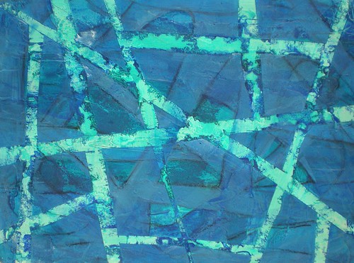
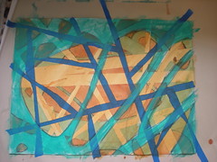
This morning I worked on another grid/branches problem where I removed the grid of tape after the first layer and put down a new grid. The paper ripped in a few places as the tape came off, but I think that might be a good thing - very bark-texture like.
Here it is with the second layer of tape still on. You can see the lighter orange lines where the first layer of tape was. I like this mesh of lines and shapes but it is very improvised. More thought and design would probably bring out some much more interesting shapes.

I also applied molding paste to my two reused canvases that I gessoed over yesterday. I'm trying, in part, to cover up texture I've already applied, and partly trying to give the canvas an underlying bark-like texture.

One canvas already had a sand texture over a large area and I didn't want all of this, so I applied absorbent ground over some of the sand. I want some areas to absorb the washes of fluid acrylic and puddles of paint in other areas.

As I painted the absorbent ground over some of the molding paste I found the paste wasn't fully dry and so it dragged. I loved the texture that made and did some more!

Finally - for the first time in over a week I had a good painting session with some purpose to it! And here is the intention I have for this series:
Theme: branches, connections, trees
Spine (a term I borrow from Twyla Tharp): the underlying grid structure of branches and roots
Size: start 3 canvases using/reusing those I already have
Explore:
  1. underlying negative shapes and relationship to an overlaid grid (linear) structure.
  2. interweaving of grid layers.