Showing posts with label color and color mixing. Show all posts

Saturday, February 5, 2011

Color and Kinetic artists

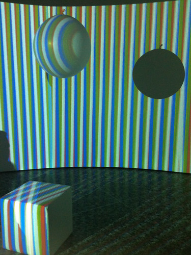
Spiral room at Color in Space and Time

Spiral chromatic room at Color in Space and Time


Over on my new blog and website - so new and so shiny! - there have been some blog posts:


Later today I will be posting about the Carlos Cruz-Diez retrospective at the Museum of Fine Arts, Houston, Color in Space and Time which opens tomorrow, but I previewed last night. First I have a lot more photos and video to upload and his lecture at the museum to attend.

Thursday, November 18, 2010

Playing with Color

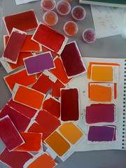
Color mixing swatches

Color mix swatches

For Untitled #5 I set myself the challenge of working in a high intensity red range. Partly because I want to see what effect the color and intensity change has on the transparent veils I paint, but also because red is not my favorite color to use. It's good to shake things up a bit!

Since I was less familiar with these colors and their potential in mixes, I spent many happy hours playing with color swatches resulting in all those red swatches in the photo.

A lot of that time was spent to figure out four starting points that would result in transparency mixes that a) the viewer can distinguish and b) I can actually mix. I started using reds as my base colors but that gave me too many indistinguishable mixes which I felt would result in confusing transparencies.


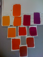
Mix pyramid

Color mix pyramid

My final color choices and the approximate mixes became those in the mix pyramid. These were small quantity mixes to help me find a starting point. The next step was to start mixing up enough of each color and each mix to finish the painting. This is when I get out my transparency grids and have to be very, very picky about the color. A couple of the mixes - the more extreme, like purple and yellow, and the closest, like purple and magenta, took multiple tries to get right.

Saturday, August 28, 2010

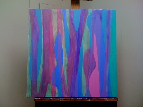
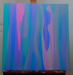
Work in progress: Untitled #2, day 2

Untitled #2, end day 2

Untitled #2 - work in progress, day 2

©2010 Caroline Roberts

The greys are blocked in now and color adjustment is underway. I carried out the overlay exercise below to check that the mixes are good and to see where I need to adjust hue or value. It's hard to judge the mixes, especially the hue, on the painting itself. If only color wasn't so relative!

After remixing a couple of colors - the grey-aqua mix is much too saturated and aqua for instance - I will repaint those areas and get the edges sharp. Each time I have to adjust a color the paint layer gets thicker and it gets harder to keep the surface smooth. Particularly as I get impatient and try to rework an area before it is fully dry. Hard to believe, but sometimes I have to actually wait for my acrylic paint to dry.

Each painting teaches me more about how my process needs to be and what my paintings are about. For a while I have wondered why I am so drawn to hard edges in my own work when I love soft, atmospheric brushwork in others' paintings. Working in these mid tones, with so many greys, it would be so easy to lose the color changes and the transparency illusion.
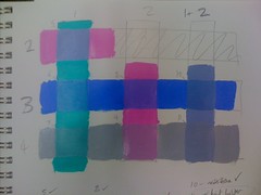
Color overlay exercise

Color Overlay Exercise

I already have my eye on the next painting. Something else small (the one above is 24" by 24", which is small for me), I'm not ready to work on that huge crazy-detailed painting yet but it is my goal. A painting you could step into.

I'd love to hear what you think about this painting - do the overlays work for you? Are they interesting? I love them but that doesn't mean everyone shares my obsession with transparencies and overlays!

Thursday, August 26, 2010

Work in Progress: Untitled #2

Untitled #2

Untitled #2 - work in progress

©2010 Caroline Roberts


I am back in the studio this week and, after a few days of pootling around with warm-up stuff like gessoing canvases and playing with colored paper, I have returned to the series I started around March. I am experimenting with the process, trying to balance planning with the need to remain sane. I used glazes of the approximate colors as a way of starting in Untitled #2 here, something I have not done before. Below is another work in progress that is currently on the backburner until I work out the process. The complicated shapes and the color balances could easily drive me crazy.

Untitled #2 is a working title - I'm thinking of giving the whole series a title, but what? Maybe Fugue - I think of each color as a 'voice' that has to work in harmony with the others. The areas of flat color are a first stab at getting these colors to work together. I think they may be too vivid, but since these are all the most colorful mixes it's hard to tell. Tomorrow I'll block in the grey tones before I decide. I'll post the next stage and I would really value your opinions on the colors.
The crazymaker painting

Untitled crazymaker painting

©2010 Caroline Roberts

Friday, February 6, 2009

Painting light

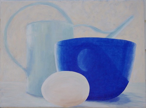
Still Life with Egg

Acrylic on canvas, 18"x24"

2008 Caroline Roberts

Finally I had a productive morning in the studio after so many days being in a virus fog. Just working on grounds and compositions but it was so nice to be back!

Something that I am continually trying to capture in my paintings is light. I'm finding that glow of light hard to capture in an abstract painting where I can't rely on the viewer's interpretation as I can in a realistic painting such as the still life above. However, I can try and use the same techniques to produce a glow. In this painting I have two techniques going on that I find interesting:

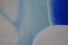
Detail #1

1. Opaque tints over a dark ground. I actually mixed gesso with acrylic color to produce these tints because I wanted the chalky look it gave me. I could probably get a similar paint if I used titanium white and a little matte medium. Sometimes I really like chalky paint but I do not know whether the gesso and acrylic mix will prove to be totally stable over time.

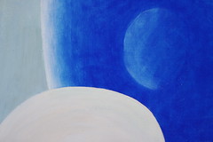
Detail #2

2. Multiple glazes over a white ground. The egg reflection is lighter because I used less glaze in that area. I love layering glazes but I have trouble getting subtle colors - most of the very transparent acrylic colors are also very saturated. I want colors that are as subtle and varied as the tints I mix with white and that I can layer in glazes without getting dark and muddy.

In this painting I have worked both light-to-dark (tints on dark grounds) and dark-to-light (glazes on white). I intend to also try underpainting and then glazing over - something frequently used in the past (in oil paint) but not something I have tried. There is no reason why I cannot use underpainting and glazing in acrylics. I read a fabulous article on the Gamblin website about the difference between classic and contemporary painting: although written for oil painters the description of direct and indirect painting could also apply to acrylic painting. I am fascinated that I can light my paintings from behind by using glazes correctly - I am seeking just that type of glow, the kind that fascinates me in stained glass windows.

Friday, November 7, 2008

Color, beautiful color

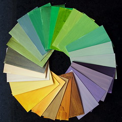
I thought I'd share something my painting tutor, Arielle Masson, spoke about in our class this week. We were discussing ways to choose colors to use in an abstract painting and she told us about the color cards she has made for herself. She uses business card sized pieces of card and paints various mixtures of her paints on them - noting the mix on the back so she can replicate it. Then, when she needs some color inspiration she spreads out the cards and tries out different combinations.

I spent a happy morning mixing colors and painting the backs of old business cards and here are the results!

I found some beautiful colors just from taking one mixture and thinking "What would happen if I added...". Some colors have 3 to 4 parent colors, not including titanium white. I'm going to continue this exercise any time I'm working.