Showing posts with label art materials. Show all posts

Monday, May 24, 2010

Acrylic Gels and Mediums, part 1

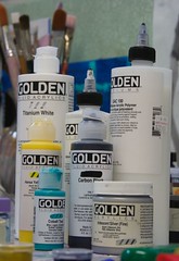
Various Golden Acrylics

You go into the art supply store looking for a single color - to replenish your ultramarine perhaps - but walking along the aisle you are distracted by the jars and bottles, the shiny colors, the fluid colors... You leave the store three hours later with a bag full of goodies and a considerably lighter wallet.

How did that happen?

A month later most of those goodies still stand unopened in your studio.

There are a myriad of gels, mediums and additives for acrylic paint, not to mention all the specialty colors on top of the full color range. Where to start?

Tube Colors
Most people, whether coming from oils, or painting for the first time, start with the tube paints. These can be used 'as is' or diluted with water or acrylic mediums. I recommend having a damp brush and clean water to hand even if you use them straight from the tube because the rapid drying of acrylic paint can make them sticky and harder to brush in a matter of moments. For this reason, squeeze out a little at a time and/or use a "Stay Wet" type palette.

You will know when the paint is starting to become dry and sticky when you feel a resistance to your movement as the brush starts to drag in the paint. At this point stop brushing unless you want a lumpy mess for a paint surface!

Fluid Acrylics
These come in squirt bottles and have an intense pigment load so used as is they are very vivid. They are wonderful for mixing with glazing and matte mediums as they are a similar viscosity (more on all that below).

Open Acrylics
I haven't used these, but Golden (who make the OPEN acrylics) advertise them as extending the workable time of acrylics - that's the time you have to do any blending or brushing before the paint gets to that sticky stage I mentioned. If you use these please comment below - I would love to post your experience here (with a link to your blog or website).

Matte Medium
The most versatile and essential medium ever, in my opinion at least! It makes a great glue for collage or just sticking stuff into a sketchbook. Mixed with acrylic colors it dries with a matte surface. I have also used it to seal edges when taping. It is very fluid (about the same viscosity as thin cream) and mixes best with fluid acrylics, but can also be used with the tube colors - just add the medium bit by bit to the tube color. It dries with a very slight haze so be careful when layering it over other colors.

Glazing Medium
Glazing mediums come in all finishes, from glossy to satin, and are useful for thinning a color down to glaze. Why not simply thin the paint with water? Well, you can, but you have to be careful how far you thin with water. Too far and there is not enough binder (the acrylic base) to hold the pigment on the canvas. When you add Glazing medium you are adding more binder to hold the pigment glaze on the canvas. And yes, you can use water and glazing medium together. Glazing medium dries totally clear.

Adding either of the above mediums to your paint also extends the 'open' time - that is the time the paint is workable before stickiness sets in. Golden also have an OPEN acrylic medium (gloss) and an OPEN Thinner which can be used to extend that time even further.

Viscosity
Viscosity is basically the thickness of the paint - the tube paints have a high viscosity because thickeners are added, the fluid acrylics have a low viscosity. A thicker paint shows brush strokes more easily and can hold texture. There are lots of mediums that make thick paint even thicker but we will come to that another time...

In mixing paints of different viscosity, e.g. tube paint and matte medium, I have found that it is easier to start with the thick paint (in this case the tube paint) and gradually add the thinner paint or medium (the matte medium). Adding thick to thin only results in lumps that never seem to go away, get caught in my brush and appear where I least want them on the canvas! It's a bit like making a white sauce from scratch, adding the milk slowly bit by bit to the butter-flour mix.

More on some of the other gels and mediums available in an upcoming post. If you haven't checked out Golden's website you should - lots of good information there. They also have a great newsletter Just Paint with all kinds of articles about paint and color. I am not in the pay of Golden (sadly) - I just love using their paints. However, I did once work for a large manufacturer of acrylic emulsions (the raw binders and thickeners), as a chemical engineer on the acrylic plant, so I have some experience and background knowledge of the acrylic bases of these paints.

Now, get in your studio and dust a few mediums down! Let me know how you get on...


Thursday, March 18, 2010

Going flat

These last few weeks I have been working on getting my paint surface 'just so'. I want even color with no visible brushstrokes, sharply defined edges between colors (especially when those colors are very similar) and a matte finish.
The matte surface can be taken care of at the varnishing stage but the rest (I suspect) is down to a mix of the paint, the brushes used, the painting surface and the brushwork itself.
So far I have been investigating the paint mix, testing every medium I could think of with fluid acrylic. All the paints and mediums I used are Golden acrylics.
Self-leveling medium was (unsurprisingly) the best at this but was also very hard to brush. Plus it is very glossy and would probably need several matte varnish coats to get an even matte-ness.
I tried a self-leveling/matte medium mix but rapidly lost the leveling nature.
The second best was GAC500, which Golden list as being for self leveling applications. It also dilutes fluid acrylics without changing their properties so it was very brush-able. I still got some brushwork ridges, but it was less sticky and viscous than self-leveling - much better to work with.

Of course, I could mask and spray, or roller, to get a brushstroke-free surface but I enjoy the moving meditation involved in this even, smooth brush painting. A painting equivalent of the hiker's "leave no trace" perhaps.

I used a transparent color (dioxazine purple) for all the trials and one thing became very clear: it is close to impossible to get a completely even coverage with a transparent color, whether I tape the edges or paint them freehand.


Thursday, April 2, 2009

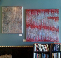
Exhibition hanging

Harvest coffee exhibition

Harvest coffee exhibition

It's been a busy, busy week since we got back from NYC, and on Saturday afternoon I hung a wall-full of paintings at Harvest coffee in Houston. The exhibition is simply titled "New Work" and is all work done in the last 12 months. Harvest have two walls that they use to exhibit works by local artists - sometimes photography, sometimes paintings, sometimes mosaics. They also have live jazz two nights a week, on Mondays and Thursday; and they make a wonderful soy latte. With that, free wi-fi and more sofas than the national coffee chain, what's not to love?

I will be sending out invitations to an artist's reception in the next few days - to get a copy sign up for my mailing list.

Remember the acrylic paint store, Guerra paints, I mentioned last time? I have ordered my first set of paints from them and I'm very excited! I ordered a very basic palette of pigment dispersions - 2 blues, 2 yellows, 1 red (I have a ton of red tubes left) and 2 whites. I did say basic - right back to my first color mixing lessons basic. Also the acrylic base and the thickener. As soon as they arrive I will start experimenting and I'll put the results here. I'm hoping to get a huge range of paint consistencies without foaming or binding issues. I will also try mixing the paints I make with the paints and mediums I already have.

Harvest coffee exhibition

Harvest coffee exhibition, part 2

On a different subject I have been loving Luann Udell's 25 Random Things: Action Steps for your Artist's Statement. I finally realized last night that my statement is not about all the work I will ever do (including in the future) but only about what I do right now. I don't know why that wasn't obvious to me before. Such a perfectionist!

Saturday, March 21, 2009

Guerra acrylics - a fantastic paint store I discovered


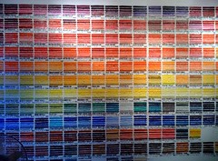
Guerra acrylics paint chart
Originally uploaded by Caro R
Today I found the most fantastic paint store in East village, Manhattan, and they ship! It's called "Guerra paint and pigment" and this is the beautiful color chart painted on the wall of their store. The owner showed me how to mix the pure pigment (ready dispersed in a carrier) into acrylic binder, which makes an acrylic a little more viscous than Golden fluid acrylics, but which can be diluted up to 600% with water. Then he added a couple of squirts of thickener as I stirred and we made tube consistency paint. It was easy to do and has me very interested in all the potential for getting exactly the paint I want!
They also have flat, or matte, acrylic bases and urethane bases which dry ultra clear and glass-like if you use transparent pigments. Glass beads or other solids can be mixed into the acrylics, as can metallics to make any color you could wish for, although again, transparents like pthalo green work best.
I don't have all the pricing details, but I suspect it could run cheaper for me than all the various gels and mediums, fluid and tube colors I purchase now. Once I get back to Houston I plan on ordering a few basics and trying them out. Results will, of course, be posted here.
Their website is http://www.guerrapaint.com and their address is 510 E 13th street, New York. I'm posting via flickr on my phone so I apologize for the lack of live links.

Tuesday, February 17, 2009

Paint Safety and Acrylic Painting Tips

Following on from my post on paint toxicity, I have a few tips for working with acrylic paint. A lot of people seem to find the fast drying time an issue, and it can be. I find drying time to be extremely unpredictable - in winter my paint dries pretty slowly but in summer it can be dry almost before the brush stroke is finished! It all comes down to humidity and temperature, although, in my experience, the heat here in summer outranks the high humidity and my paint still dries fast. However, it's probably far faster in Arizona.

Before I start however, a twitter contact, Edward Kinnally, let me know about an article he wrote on art material safety which covers the standards applying to paint. Ever wondered what "non-toxic" really means? That one was a shocker for me.

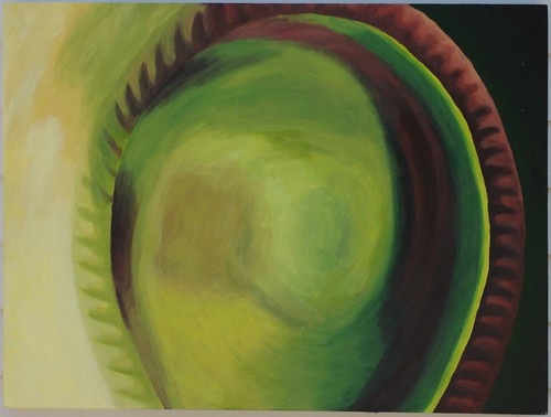
Perrier Bottle

30"x40" acrylic on canvas

2007 Caroline Roberts

So, how can we blend when the paint dries so fast? Here I painted the base of a perrier bottle in the (attempted) style of Georgia O'Keefe. I used acrylic paints and in some areas I managed blending that I am very pleased with. My 'trick'? I mixed the main hues that I needed ahead of time and worked one small blending area at a time, blending my paint as much on the palette as on the canvas. I also keep a spray bottle on hand and regularly mist the palette and the canvas to keep the paint workable. When I feel the paint dragging at my brush I stop work on that area - the dragging means that a skin is forming and continuing to work will only make the paint textured and lumpy. If I have to stop before I'm happy with the blending then I simply come back after that layer is dry and repaint the areas that didn't work.

For a palette I mainly use a piece of glass with white paper taped underneath. I spray it regularly with water to keep the paint from drying and i cover it with plastic wrap (or cling film in the UK) to keep it from drying between sessions. I also use freezer paper which is the same as those disposable paper palettes but much cheaper. I have a stay-wet palette but I don't often use it because I find the surface a little small. It's good for studies and smaller canvases. Depends how big, or messy, you work really. For large quantities of paints or glazes I re-use paint pots, glass spice jars and plastic medicine pots. I am probably stating the obvious, but if you restrict the surface area you slow down the drying, so these little pots can keep a glaze workable for weeks if I close it up after use.

Now, I freely confess, I have very little experience with oil paint because I don't like the smell of turps and I have eczema so have avoided mineral spirits (this was before I learnt I should wear gloves whilst painting). What a career-long oil painter might see as restrictions on their normal way of working I see as normal limitations of a media.

Which is all another way of saying that I am making assumptions, based on the blog posts I read about acrylic paints, on the issues people find when they are new to acrylics. I would love to hear your questions so I know the real issues, and I will answer them as best I can. I am always learning something new about acrylics and I know there is so much more out there to know. I will share any discoveries I find to be repeatable.

Monday, February 2, 2009

Toxicity of Pigments

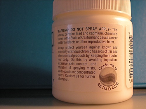
Hazard information on zinc white acrylic paint

I have a confession to make. I have a background in the chemical industry. So when I see those hazard warnings on the back of my paints I take notice. Health and safety isn't often mentioned in connection with fine arts, but we are exposed to more toxins than we may be aware of. You may know that the cadmiums are toxic but what about your other paint colors? Are they toxic? I am not saying do not use toxic paints. In fact, my research leads me to believe that would be pretty much impossible, but you should know what you are handling and take care.

A little chemistry: most, but not all, of the toxicity issues are associated with heavy, or toxic, metals such as copper, cobalt, cadmium, lead. Over time these poison the body and many are known or suspected to be carcinogens. If you remember your periodic table from chemistry, these are transition metals from that central section. So a quick rule of thumb is that if there's a heavy metal in the pigment name, it's probably toxic.

Below are lists of highly toxic and moderately toxic pigments used in acrylic and oil paints, possibly in pastels and other dry media too. Since color names can be inconsistent, the pigment name follows in parentheses. The pigment used is usually listed somewhere on the tube - see photo. Also, the paint manufacturer will have Material Safety Data Sheets (MSDS) on their website. Some of the 'hue' colors contain less toxic pigments, e.g. my Cadmium Red Hue contains Toluidine Red (moderately toxic) in place of Cadmium Red (highly toxic), however it is not as opaque as a true cadmium red.

Pigment names on different brands of acrylic paint


NB This list is NOT exhaustive. I pulled up the MSDS on the Golden website to check some of my paints and was shocked to find that almost every color they manufacture has some kind of toxicity issue associated with the pigment.

After the lists are some pointers on handling your toxic paints safely. Hopefully you know and follow these already!

Update: After posting this I found a posting on art material safety by Edward Kinnally that summarizes all the standards, such as ASTM and the term "non-toxic". A very in-depth and useful resource.

Highly Toxic Pigments
  • antimony white (antimony trioxide)
  • barium yellow (barium chromate)
  • burnt or raw umber (iron oxides, manganese silicates or dioxide)
  • cadmium red, orange or yellow (cadmium sulfide, cadmium selenide)
  • chrome green (Prussian blue, lead chromate)
  • chrome orange (lead carbonate)
  • chrome yellow (lead chromate)
  • cobalt violet (cobalt arsenate or cobalt phosphate)
  • cobalt yellow (potassium cobalt nitrate)
  • lead or flake white (lead carbonate)
  • lithol red (sodium, barium and calcium salts of azo pigments)
  • manganese violet (manganese ammonium pyrophosphate)
  • molybdate orange (lead chromate, lead molybdate, lead sulfate)
  • naples yellow (lead antimonate)
  • strontium yellow (strontium chromate)
  • vermilion (mercuric sulfide)
  • zinc sulfide
  • zinc yellow (zinc chromate)

Moderately Toxic Pigments
  • alizarin crimson
  • carbon black
  • cerulean blue (cobalt stannate)
  • cobalt blue (cobalt stannate)
  • cobalt green (calcined cobalt, zinc and aluminum oxides)
  • chromium oxide green (chromic oxide)
  • Phthalo blue and greens (copper phthalocyanine)
  • manganese blue (barium manganate, barium sulfate)
  • Prussian blue (ferric ferrocyanide)
  • toluidine red and yellow (insoluble azo pigment)
  • viridian (hydrated chromic oxide)
  • zinc white (zinc oxide)

How to handle toxic paints safely
  1. Do not use the same containers for paints that you do for food or drink. Well, duh, but thought I'd put it in anyway.
  2. Do not put paint brushes in your mouth! Use a brush holder or a piece of kitchen towel.
  3. Wash hands thoroughly after each painting session.
  4. Even better, wear latex gloves whilst painting, or at least whilst using the toxic pigments. I hate wearing gloves but after researching this topic I will be wearing them. Simple as that.
  5. Wear a dust mask if you handle pigment powders. Make sure it's the right one and keep it clean!
  6. Do not have food in your studio and use covered drinks containers.
  7. Since we don't want heavy metals in our rivers either, wipe up paints with kitchen towel and dispose of in the trash, not down the drain.
  8. If you sand your paints at all (as an acrylic painter, yes I do) then wear a respiratory mask. Keeping the paint surface damp as you sand also keeps the dust down.