Showing posts with label acrylic painting. Show all posts

Thursday, September 2, 2010

Untitled #2 - the finished painting

Untitled #2

Untitled #2

©2010 Caroline Roberts

24"x24" acrylic on canvas

Ta-dah! I managed to stop before I got perfectionist and started fussing about edges being smooth to the molecular scale. It's a fine line (bad pun intended).

I started the next painting, excitingly titled "Untitled #3" - bet you didn't see that one coming. I pretty much agree with Rauschenberg that paintings are like children: you have to name them something. The trouble is choosing a name that leaves the viewer to interpret as they wish. "Untitled" seems so much less intriguing than, say, "Ortho" , or even "Fred".

However, I am now going to scrap that new canvas and start again. It took a bit of soul-searching to decide that, after all, several hours went into laying it out and blocking in some colors. But in the end I believe it will pay off.

Unfortunately I decided to try and reuse a canvas and the uneven layer of paint is preventing me from achieving the smooth surface and lines that I want, despite sanding and gessoing. The brush sticks and drags as it goes across the old paint in an annoying way that doesn't happen on a nice, fresh canvas. Luckily, since I stretch my own it will "only" involve pulling the old canvas off (embedding a few staples in fingers as I go) and stretching a new canvas onto the bars.

Really, it's for the best. Now I know not to reuse canvas for these flat planes. But will I ever learn anything without making a mistake first?

Saturday, August 28, 2010

Work in progress: Untitled #2, day 2

Untitled #2, end day 2

Untitled #2 - work in progress, day 2

©2010 Caroline Roberts

The greys are blocked in now and color adjustment is underway. I carried out the overlay exercise below to check that the mixes are good and to see where I need to adjust hue or value. It's hard to judge the mixes, especially the hue, on the painting itself. If only color wasn't so relative!

After remixing a couple of colors - the grey-aqua mix is much too saturated and aqua for instance - I will repaint those areas and get the edges sharp. Each time I have to adjust a color the paint layer gets thicker and it gets harder to keep the surface smooth. Particularly as I get impatient and try to rework an area before it is fully dry. Hard to believe, but sometimes I have to actually wait for my acrylic paint to dry.

Each painting teaches me more about how my process needs to be and what my paintings are about. For a while I have wondered why I am so drawn to hard edges in my own work when I love soft, atmospheric brushwork in others' paintings. Working in these mid tones, with so many greys, it would be so easy to lose the color changes and the transparency illusion.

Color overlay exercise

Color Overlay Exercise

I already have my eye on the next painting. Something else small (the one above is 24" by 24", which is small for me), I'm not ready to work on that huge crazy-detailed painting yet but it is my goal. A painting you could step into.

I'd love to hear what you think about this painting - do the overlays work for you? Are they interesting? I love them but that doesn't mean everyone shares my obsession with transparencies and overlays!

Thursday, August 26, 2010

Work in Progress: Untitled #2

Untitled #2

Untitled #2 - work in progress

©2010 Caroline Roberts


I am back in the studio this week and, after a few days of pootling around with warm-up stuff like gessoing canvases and playing with colored paper, I have returned to the series I started around March. I am experimenting with the process, trying to balance planning with the need to remain sane. I used glazes of the approximate colors as a way of starting in Untitled #2 here, something I have not done before. Below is another work in progress that is currently on the backburner until I work out the process. The complicated shapes and the color balances could easily drive me crazy.

Untitled #2 is a working title - I'm thinking of giving the whole series a title, but what? Maybe Fugue - I think of each color as a 'voice' that has to work in harmony with the others. The areas of flat color are a first stab at getting these colors to work together. I think they may be too vivid, but since these are all the most colorful mixes it's hard to tell. Tomorrow I'll block in the grey tones before I decide. I'll post the next stage and I would really value your opinions on the colors.
The crazymaker painting

Untitled crazymaker painting

©2010 Caroline Roberts

Monday, May 24, 2010

Acrylic Gels and Mediums, part 1

Various Golden Acrylics

You go into the art supply store looking for a single color - to replenish your ultramarine perhaps - but walking along the aisle you are distracted by the jars and bottles, the shiny colors, the fluid colors... You leave the store three hours later with a bag full of goodies and a considerably lighter wallet.

How did that happen?

A month later most of those goodies still stand unopened in your studio.

There are a myriad of gels, mediums and additives for acrylic paint, not to mention all the specialty colors on top of the full color range. Where to start?

Tube Colors
Most people, whether coming from oils, or painting for the first time, start with the tube paints. These can be used 'as is' or diluted with water or acrylic mediums. I recommend having a damp brush and clean water to hand even if you use them straight from the tube because the rapid drying of acrylic paint can make them sticky and harder to brush in a matter of moments. For this reason, squeeze out a little at a time and/or use a "Stay Wet" type palette.

You will know when the paint is starting to become dry and sticky when you feel a resistance to your movement as the brush starts to drag in the paint. At this point stop brushing unless you want a lumpy mess for a paint surface!

Fluid Acrylics
These come in squirt bottles and have an intense pigment load so used as is they are very vivid. They are wonderful for mixing with glazing and matte mediums as they are a similar viscosity (more on all that below).

Open Acrylics
I haven't used these, but Golden (who make the OPEN acrylics) advertise them as extending the workable time of acrylics - that's the time you have to do any blending or brushing before the paint gets to that sticky stage I mentioned. If you use these please comment below - I would love to post your experience here (with a link to your blog or website).

Matte Medium
The most versatile and essential medium ever, in my opinion at least! It makes a great glue for collage or just sticking stuff into a sketchbook. Mixed with acrylic colors it dries with a matte surface. I have also used it to seal edges when taping. It is very fluid (about the same viscosity as thin cream) and mixes best with fluid acrylics, but can also be used with the tube colors - just add the medium bit by bit to the tube color. It dries with a very slight haze so be careful when layering it over other colors.

Glazing Medium
Glazing mediums come in all finishes, from glossy to satin, and are useful for thinning a color down to glaze. Why not simply thin the paint with water? Well, you can, but you have to be careful how far you thin with water. Too far and there is not enough binder (the acrylic base) to hold the pigment on the canvas. When you add Glazing medium you are adding more binder to hold the pigment glaze on the canvas. And yes, you can use water and glazing medium together. Glazing medium dries totally clear.

Adding either of the above mediums to your paint also extends the 'open' time - that is the time the paint is workable before stickiness sets in. Golden also have an OPEN acrylic medium (gloss) and an OPEN Thinner which can be used to extend that time even further.

Viscosity
Viscosity is basically the thickness of the paint - the tube paints have a high viscosity because thickeners are added, the fluid acrylics have a low viscosity. A thicker paint shows brush strokes more easily and can hold texture. There are lots of mediums that make thick paint even thicker but we will come to that another time...

In mixing paints of different viscosity, e.g. tube paint and matte medium, I have found that it is easier to start with the thick paint (in this case the tube paint) and gradually add the thinner paint or medium (the matte medium). Adding thick to thin only results in lumps that never seem to go away, get caught in my brush and appear where I least want them on the canvas! It's a bit like making a white sauce from scratch, adding the milk slowly bit by bit to the butter-flour mix.

More on some of the other gels and mediums available in an upcoming post. If you haven't checked out Golden's website you should - lots of good information there. They also have a great newsletter Just Paint with all kinds of articles about paint and color. I am not in the pay of Golden (sadly) - I just love using their paints. However, I did once work for a large manufacturer of acrylic emulsions (the raw binders and thickeners), as a chemical engineer on the acrylic plant, so I have some experience and background knowledge of the acrylic bases of these paints.

Now, get in your studio and dust a few mediums down! Let me know how you get on...


Thursday, March 18, 2010

Going flat

These last few weeks I have been working on getting my paint surface 'just so'. I want even color with no visible brushstrokes, sharply defined edges between colors (especially when those colors are very similar) and a matte finish.
The matte surface can be taken care of at the varnishing stage but the rest (I suspect) is down to a mix of the paint, the brushes used, the painting surface and the brushwork itself.
So far I have been investigating the paint mix, testing every medium I could think of with fluid acrylic. All the paints and mediums I used are Golden acrylics.
Self-leveling medium was (unsurprisingly) the best at this but was also very hard to brush. Plus it is very glossy and would probably need several matte varnish coats to get an even matte-ness.
I tried a self-leveling/matte medium mix but rapidly lost the leveling nature.
The second best was GAC500, which Golden list as being for self leveling applications. It also dilutes fluid acrylics without changing their properties so it was very brush-able. I still got some brushwork ridges, but it was less sticky and viscous than self-leveling - much better to work with.

Of course, I could mask and spray, or roller, to get a brushstroke-free surface but I enjoy the moving meditation involved in this even, smooth brush painting. A painting equivalent of the hiker's "leave no trace" perhaps.

I used a transparent color (dioxazine purple) for all the trials and one thing became very clear: it is close to impossible to get a completely even coverage with a transparent color, whether I tape the edges or paint them freehand.


Wednesday, June 10, 2009

Herne's Oak: A work in progress

Herne's Oak, this morning
48"x48", acrylic on canvas
©2008 Caroline Roberts

Herne's Oak is a painting I 'finished' a year ago. Except that I wasn't finished, I was just stuck. The painting didn't have the drama and mystery I wanted but I was afraid to mess up what I did like about it.

After a year of looking at it on my wall I'm no longer afraid to change things around - that intense initial attachment to the painting has faded. Plus I have more experience and my abstract studies have given me a lot of insights. I'm building up the contrast to heighten the drama and I'm trying to clarify the fantastic branch shapes that I love. In the process a whole tree disappeared, branches moved around and Herne's owl eyes and antlers got pushed back to glare eerily at you through the ghostly trees.

Herne's Oak, work-in-progress
48"x48", acrylic on canvas
©2008 Caroline Roberts


Herne the Hunter was a huntsman at Windsor Forest for King Richard II. Legend has it that he was caught poaching in the forest and was hung from an oak tree, now known as Herne's Oak.

I first came across Herne whilst reading Susan Cooper's The Dark Is Rising series as a child. In the second book Herne comes in as a Wild Huntsman who flies across the winter sky with the face of an owl and the antlers of a deer. Since then I've found other references to a similar huntsman in Mary Stewart's Merlin Trilogy that has him as Arawn, the King of the Otherworld. So this painting should be dramatic and downright eery to do the legend justice.

I plan on bringing out the front ghost horse a little more. I also want to push the central tree back by lightening it and blending it into the background somewhat. I think it is too central to be so dramatic. I checked the circularity of the moon (good old Photoshop!) and, as I guessed, my moon is off a tad at the left. The red sky will be gradated - enough that it makes the moon glow but not so much that I lose the branches (I hope).

Perhaps I need to use highlights to make the branches glow in the moonlight, then I can have a darker sky at the edge?. By adding layers of paint I have lost some of the ghostly, other-worldliness that I wanted, tomorrow I shall try and regain that.


Thursday, March 12, 2009

Art Expo - what a crazy day!

Pine Tree

2007, Caroline Roberts, 36"x36"

Today I was at the Art Exposition at my son's school. My head is reeling. Four hours sitting at a table talking to elementary age kids about my art. I had an hour to set up and then barely a break all day. Chatting to those kids was so much fun - there were several groups that I had really interesting conversations with. Several of the third and fourth graders really seemed to 'get' the idea of abstract art and I had a long chat with one guy who looked like his mind exploded when we discussed how the simpler paintings were harder to do! Seeing a lightbulb go on inside someone's head is just amazing, maybe I should do some teaching?

I wrote and printed up 100 copies of a newsletter and handed out every single one. While I was at the expo I noted down a few things that I learnt for next time:
- I need more handouts, maybe even postcards, the kids love to get "stuff".
- Have some small paintings on the table: everyone looked at the table before they looked at the backboard where the paintings were hanging.
- The Moms that lead the kids round have a definite bias to the jewelry tables. Not sure how I can compete there!
- Tables where there were demos going on were popular. Maybe I can do some actual painting next time.

Things I did that worked well:
- I had sketchbooks and larger color studies on the table and I found that kids and adults alike were interested to hear how I worked on ideas. So many people think we just walk up to a blank canvas and paint.
- Kids love to be asked about their favorite things to draw and their favorite colors.
- I let them touch some color studies and one painting and they loved this. Next time I shall bring small color studies with loads of textures - the showy stuff is fascinating to them.
- the business cards with different paintings on them. Was so glad I didn't use any of my old vistaprint ones when I saw several of the other exhibitors with standard vistaprint cards.

I'm proud of myself for just getting there and having a newsletter and business cards - there's been so much sickness in our house the last month. My son and I have coughs that have led to infections and asthma, so I also have continual jitters from the albuterol. I am so glad that spring break starts tomorrow for us and I have a week off. New York here I come! Really. I am so excited... I am going to try posting by email but who knows if I'll manage to get photos as well as text? This will be one big, fun experiment!

Tuesday, February 24, 2009

A Phase painting in progress

Small section of Phase I

Yesterday I had five whole, uninterrupted hours in the studio. Fantastic. Forgot to eat of course and only stopped when my head went all dizzy. I started a 20" by 50" painting inspired by the music Piano Phase by Steve Reich. A group of three curves is altered in 2 ways - proximity and curvature - in an out-of-phase manner - one goes through 2 cycles, the other 3, over the length of the painting. Perhaps not entirely unexpectedly, if I think of sound waves, this sets up an interference pattern - a pattern within a pattern. So the color order is based on this interference pattern - 3 colors can be arranged in 6 different ways and there were 6 combinations of proximity and curvature, including the base combination.

The above photograph is where I had to stop. The ultramarine is the ground which will show through the colors to a degree. I do not want this to be a flat 'pattern' - I want it to look hand-crafted and to have a little depth. So no tape or flat paint here, although Illustrator was employed as a design tool.

Painting the underlying curves

Yes, in this shot the canvas is awful slack. I made this canvas myself - the first time I've made one this big and awkwardly shaped, but I had a very specific size in mind for the piece. I did cheat and use pre-primed canvas - I really did not want to spend a couple of days just priming. Spritzing the back with water soon had that canvas nice and taut though. A little more practice and I'll get it right.

I had a week blissfully clear of appointments and non-studio stuff and what happened? My son got sick. Some kind of virus that's really just a cold but comes with a fever that spikes on and off for, wait for it... FIVE days. Just as I was thinking I should take a look at all those doors that opened but I haven't walked through yet. So, Universe, what is it now? I was going to call a few of those people I should have called long ago: and now? Maybe tomorrow he'd like to sit on the studio sofa and draw while I get some painting done.

Still, have finally decided that my daughter will go to the pre-K program at the public school from the fall. Some part of me gave up feeling bad and selfish because I want that extra time. Hey, if the worst-case scenarios come true it will be handy having them on the same schedule, and the same if best-case scenarios come true. Like I get enough customers for my paintings that I need to paint more hours to keep up with demand. A girl can (and will) dream!

Somewhat linked to that dream I have another goal for this year:
Actually label and file away expense receipts as they happen, keeping some kind of rudimentary accounts spreadsheet.
Yep, I thought about doing that all this year but when I came to do my taxes... yes, you guessed it, no receipts in the folder. Even if sales don't pick up because of the recession I can at least make good paperwork habits.

Tuesday, February 17, 2009

Paint Safety and Acrylic Painting Tips

Following on from my post on paint toxicity, I have a few tips for working with acrylic paint. A lot of people seem to find the fast drying time an issue, and it can be. I find drying time to be extremely unpredictable - in winter my paint dries pretty slowly but in summer it can be dry almost before the brush stroke is finished! It all comes down to humidity and temperature, although, in my experience, the heat here in summer outranks the high humidity and my paint still dries fast. However, it's probably far faster in Arizona.

Before I start however, a twitter contact, Edward Kinnally, let me know about an article he wrote on art material safety which covers the standards applying to paint. Ever wondered what "non-toxic" really means? That one was a shocker for me.

Perrier Bottle

30"x40" acrylic on canvas

2007 Caroline Roberts

So, how can we blend when the paint dries so fast? Here I painted the base of a perrier bottle in the (attempted) style of Georgia O'Keefe. I used acrylic paints and in some areas I managed blending that I am very pleased with. My 'trick'? I mixed the main hues that I needed ahead of time and worked one small blending area at a time, blending my paint as much on the palette as on the canvas. I also keep a spray bottle on hand and regularly mist the palette and the canvas to keep the paint workable. When I feel the paint dragging at my brush I stop work on that area - the dragging means that a skin is forming and continuing to work will only make the paint textured and lumpy. If I have to stop before I'm happy with the blending then I simply come back after that layer is dry and repaint the areas that didn't work.

For a palette I mainly use a piece of glass with white paper taped underneath. I spray it regularly with water to keep the paint from drying and i cover it with plastic wrap (or cling film in the UK) to keep it from drying between sessions. I also use freezer paper which is the same as those disposable paper palettes but much cheaper. I have a stay-wet palette but I don't often use it because I find the surface a little small. It's good for studies and smaller canvases. Depends how big, or messy, you work really. For large quantities of paints or glazes I re-use paint pots, glass spice jars and plastic medicine pots. I am probably stating the obvious, but if you restrict the surface area you slow down the drying, so these little pots can keep a glaze workable for weeks if I close it up after use.

Now, I freely confess, I have very little experience with oil paint because I don't like the smell of turps and I have eczema so have avoided mineral spirits (this was before I learnt I should wear gloves whilst painting). What a career-long oil painter might see as restrictions on their normal way of working I see as normal limitations of a media.

Which is all another way of saying that I am making assumptions, based on the blog posts I read about acrylic paints, on the issues people find when they are new to acrylics. I would love to hear your questions so I know the real issues, and I will answer them as best I can. I am always learning something new about acrylics and I know there is so much more out there to know. I will share any discoveries I find to be repeatable.

Friday, February 6, 2009

Painting light

Still Life with Egg

Acrylic on canvas, 18"x24"

2008 Caroline Roberts

Finally I had a productive morning in the studio after so many days being in a virus fog. Just working on grounds and compositions but it was so nice to be back!

Something that I am continually trying to capture in my paintings is light. I'm finding that glow of light hard to capture in an abstract painting where I can't rely on the viewer's interpretation as I can in a realistic painting such as the still life above. However, I can try and use the same techniques to produce a glow. In this painting I have two techniques going on that I find interesting:

Detail #1

1. Opaque tints over a dark ground. I actually mixed gesso with acrylic color to produce these tints because I wanted the chalky look it gave me. I could probably get a similar paint if I used titanium white and a little matte medium. Sometimes I really like chalky paint but I do not know whether the gesso and acrylic mix will prove to be totally stable over time.

Detail #2

2. Multiple glazes over a white ground. The egg reflection is lighter because I used less glaze in that area. I love layering glazes but I have trouble getting subtle colors - most of the very transparent acrylic colors are also very saturated. I want colors that are as subtle and varied as the tints I mix with white and that I can layer in glazes without getting dark and muddy.

In this painting I have worked both light-to-dark (tints on dark grounds) and dark-to-light (glazes on white). I intend to also try underpainting and then glazing over - something frequently used in the past (in oil paint) but not something I have tried. There is no reason why I cannot use underpainting and glazing in acrylics. I read a fabulous article on the Gamblin website about the difference between classic and contemporary painting: although written for oil painters the description of direct and indirect painting could also apply to acrylic painting. I am fascinated that I can light my paintings from behind by using glazes correctly - I am seeking just that type of glow, the kind that fascinates me in stained glass windows.

Monday, February 2, 2009

Toxicity of Pigments

Hazard information on zinc white acrylic paint

I have a confession to make. I have a background in the chemical industry. So when I see those hazard warnings on the back of my paints I take notice. Health and safety isn't often mentioned in connection with fine arts, but we are exposed to more toxins than we may be aware of. You may know that the cadmiums are toxic but what about your other paint colors? Are they toxic? I am not saying do not use toxic paints. In fact, my research leads me to believe that would be pretty much impossible, but you should know what you are handling and take care.

A little chemistry: most, but not all, of the toxicity issues are associated with heavy, or toxic, metals such as copper, cobalt, cadmium, lead. Over time these poison the body and many are known or suspected to be carcinogens. If you remember your periodic table from chemistry, these are transition metals from that central section. So a quick rule of thumb is that if there's a heavy metal in the pigment name, it's probably toxic.

Below are lists of highly toxic and moderately toxic pigments used in acrylic and oil paints, possibly in pastels and other dry media too. Since color names can be inconsistent, the pigment name follows in parentheses. The pigment used is usually listed somewhere on the tube - see photo. Also, the paint manufacturer will have Material Safety Data Sheets (MSDS) on their website. Some of the 'hue' colors contain less toxic pigments, e.g. my Cadmium Red Hue contains Toluidine Red (moderately toxic) in place of Cadmium Red (highly toxic), however it is not as opaque as a true cadmium red.

Pigment names on different brands of acrylic paint


NB This list is NOT exhaustive. I pulled up the MSDS on the Golden website to check some of my paints and was shocked to find that almost every color they manufacture has some kind of toxicity issue associated with the pigment.

After the lists are some pointers on handling your toxic paints safely. Hopefully you know and follow these already!

Update: After posting this I found a posting on art material safety by Edward Kinnally that summarizes all the standards, such as ASTM and the term "non-toxic". A very in-depth and useful resource.

Highly Toxic Pigments
  • antimony white (antimony trioxide)
  • barium yellow (barium chromate)
  • burnt or raw umber (iron oxides, manganese silicates or dioxide)
  • cadmium red, orange or yellow (cadmium sulfide, cadmium selenide)
  • chrome green (Prussian blue, lead chromate)
  • chrome orange (lead carbonate)
  • chrome yellow (lead chromate)
  • cobalt violet (cobalt arsenate or cobalt phosphate)
  • cobalt yellow (potassium cobalt nitrate)
  • lead or flake white (lead carbonate)
  • lithol red (sodium, barium and calcium salts of azo pigments)
  • manganese violet (manganese ammonium pyrophosphate)
  • molybdate orange (lead chromate, lead molybdate, lead sulfate)
  • naples yellow (lead antimonate)
  • strontium yellow (strontium chromate)
  • vermilion (mercuric sulfide)
  • zinc sulfide
  • zinc yellow (zinc chromate)

Moderately Toxic Pigments
  • alizarin crimson
  • carbon black
  • cerulean blue (cobalt stannate)
  • cobalt blue (cobalt stannate)
  • cobalt green (calcined cobalt, zinc and aluminum oxides)
  • chromium oxide green (chromic oxide)
  • Phthalo blue and greens (copper phthalocyanine)
  • manganese blue (barium manganate, barium sulfate)
  • Prussian blue (ferric ferrocyanide)
  • toluidine red and yellow (insoluble azo pigment)
  • viridian (hydrated chromic oxide)
  • zinc white (zinc oxide)

How to handle toxic paints safely
  1. Do not use the same containers for paints that you do for food or drink. Well, duh, but thought I'd put it in anyway.
  2. Do not put paint brushes in your mouth! Use a brush holder or a piece of kitchen towel.
  3. Wash hands thoroughly after each painting session.
  4. Even better, wear latex gloves whilst painting, or at least whilst using the toxic pigments. I hate wearing gloves but after researching this topic I will be wearing them. Simple as that.
  5. Wear a dust mask if you handle pigment powders. Make sure it's the right one and keep it clean!
  6. Do not have food in your studio and use covered drinks containers.
  7. Since we don't want heavy metals in our rivers either, wipe up paints with kitchen towel and dispose of in the trash, not down the drain.
  8. If you sand your paints at all (as an acrylic painter, yes I do) then wear a respiratory mask. Keeping the paint surface damp as you sand also keeps the dust down.

Tuesday, January 20, 2009

Geometric Abstraction - part 2

Shards

Some time ago I posted about a large (22" by 48") geometric abstraction I had been working on. By calling that blog entry "part 1" I pretty much promised you a peek at the finished results and here they are. This painting took hours of painstaking work with taping then layer after layer of paint to get a beautifully smooth, opaque color. It is finished with a matte varnish to give the paint a chalky look which I love in these very opaque tints.

To summarize the process, in case you're interested in doing something similar and giving yourself a headache:
  1. designed painting in Illustrator, working from an initial photo and color studies
  2. painted colored ground
  3. measured and taped outside of shapes (where 2 overlapped - minimizing measuring and taping)
  4. used matte medium to seal the tape edges (2 coats)
  5. used gesso on inside of shapes for a nice, white ground
  6. added tape to define individual shapes, using matte medium to seal new edges
  7. painted each shape (with fluid acrylics) multiple times to achieve an opaque, smooth surface
  8. changed tape location and repeated above 2 steps as necessary
  9. pulled off tape and touched up edges
  10. matte varnish

Shards (in progress)

Here it is in progress with the tape still on. As you can see it was very hard to judge how the final piece would look and I did have to repaint some areas to balance the colors and composition after I took some of the tape off. Taking all the tape off was indeed a magical moment as the painting appeared. Despite my careful taping and sealing using matte medium I still had to touch up some areas where paint or gesso had leaked under the tape. Saying that though, I really enjoyed working on this painting - I learnt a lot about how difficult seemingly simple things can be. It also felt meditative to work on such a carefully planned piece. I will probably work like this again, although perhaps not so large or so complex. If I did I would only complete around four a year - that would be four VERY expensive paintings a year. And would be a nightmare to live with.

I love this painting and something about working this way appealed to me - I just have to find out exactly what. Every class I have taken at Glassell has pushed me to try something I would not otherwise have done - a technique, a genre, a subject - sorting out the personal wheat from the chaff is my ongoing homework.

Saturday, November 29, 2008

Geometric Abstraction - part 1

Geometric Abstraction started in the early 20th century with artists such as Wassily Kandinsky and Kasimir Malevich. It is an art based on simple geometric forms - an art of pure form with no emotional content from the artist.

My Take
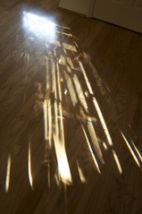
In my course on abstract art at Glassell, one of my assignments is a geometric abstraction. The piece I'm working on was inspired by the light patterns coming through my front door one morning. I was about to rush out the door so I grabbed my camera and took this photo.

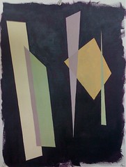
I used Illustrator to trace some of the shapes using the pen tool. It reminded me strongly of light streaming in through a stained glass window so I went with that feeling but with a dark purple ground in place of black. Using that purple as my starting point I played around with the light colors. After a few hours of happy color mixing and recording I came up with a diaz. purple, nickel azo gold, pthalo green (blue shade) combination that gave me these fabulously complex colors I used in this color test piece.

The next step was to paint the final canvas with the purple ground. It took me a couple of sessions and several glazes to be happy with the color. This had to be it because there is no going back once the taping starts!

Oh yes. Taping. I hate taping. But at least these are straight lines. My previous taping experience was with curves and did not work out so well. In this painting though I think perfect straight lines are called for. I tried hand painting in the color trials and I could spend as much time tidying up edges as I might spend applying tape.

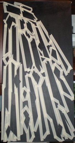
In fact, the taping turned out to be bigger and scarier in my mind than it was in reality. It took me a total of 7 hours to measure, rule and tape the entire 24" by 48" canvas. Thank goodness for the measure tool in Illustrator is all I can say. About 3 hours in I realized what Arielle really meant by a "kick-ass" painting! Here it is after the taping. Once that mammoth task was done I was excited to get moving again. I have sealed the tape in with two coats of matte medium (in the hope that this will stop paint from seeping under the tape) and applied two coats of gesso so my light colors will glow. If I had not used tape painting 2 coats of gesso and then color would have finished off my tiny supply of patience.

Friday, November 21, 2008

Tina Mammoser's Work in Progress Series


Thornness Bay, Low Tide, originally uploaded by tina-m.

Tina Mammoser, whose artist blog I follow, is running a series of blogs about a work-in-progress that I'm finding fascinating. I love reading about how other people put their paintings together, especially ones as beautiful as Tina's. This is the canvas the series is about - Thornness Bay, Low Tide.

So far Tina has blogged about:
- Source and preparation
- Underpainting
- Midlayers of color

I can't wait to see the post tomorrow about the final glazes. I've found this series very inspiring!

Monday, October 27, 2008

Starting a Series

For some time now I've been wanting to work on a series of paintings in a theme. Katherine Tyrrell's blog entry on working in series coupled with another inspiring article I found on her squidoo lens pushed me to begin.

My plan is for a series of paintings with the theme of trees. Our current Glassell assignment is on the grid and this was my first attempt. A jumbled mess - I lost the clarity in the background because I added too many layers. I love using transparent color but losing clarity can be a real issue.

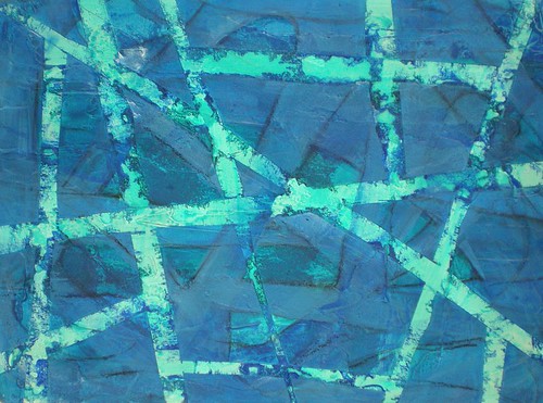
This morning I worked on another grid/branches problem where I removed the grid of tape after the first layer and put down a new grid. The paper ripped in a few places as the tape came off, but I think that might be a good thing - very bark-texture like.

Here it is with the second layer of tape still on. You can see the lighter orange lines where the first layer of tape was. I like this mesh of lines and shapes but it is very improvised. More thought and design would probably bring out some much more interesting shapes.

I also applied molding paste to my two reused canvases that I gessoed over yesterday. I'm trying, in part, to cover up texture I've already applied, and partly trying to give the canvas an underlying bark-like texture.

One canvas already had a sand texture over a large area and I didn't want all of this, so I applied absorbent ground over some of the sand. I want some areas to absorb the washes of fluid acrylic and puddles of paint in other areas.

As I painted the absorbent ground over some of the molding paste I found the paste wasn't fully dry and so it dragged. I loved the texture that made and did some more!

Finally - for the first time in over a week I had a good painting session with some purpose to it! And here is the intention I have for this series:
Theme: branches, connections, trees
Spine (a term I borrow from Twyla Tharp): the underlying grid structure of branches and roots
Size: start 3 canvases using/reusing those I already have
Explore:
  1. underlying negative shapes and relationship to an overlaid grid (linear) structure.
  2. interweaving of grid layers.

Monday, May 5, 2008

The Goal

The other day I was trying something out on a small scale ready to use in a painting and I came up with an idea to work on over the summer. I call it the 'Crack of Dawn Experiments'. Why? Well, the only reliable time of day I can find to paint is to get up before everyone else and get out to the studio at the crack of dawn, 5:45am to be precise. Then I can get an hour of work in before I have to get my son up and fed before the school bus.

So, I was looking at these lists of scribbled ideas of techniques and material combinations I want to try out and I decided to collect them and work on them over the next three to four months before my next class resumes. I'll need something to get me out of bed every day when there is no school bus to get our day moving.

The goal is to develop a set of acrylic techniques and a language of mark-making that is MINE, all mine. But also to have fun and explore all those little alleys I glimpsed as I went down the thoroughfare that was my painting class this year.

I also intend that some of these 'experiments' (yes, I have a scientific background) will become initial sketches for full-fledged paintings and that I will have at least ten completed works by September, as well as a folder and sketchbook full of the results.

The experiments seem to fall into some broad groups:
  • ways of applying paint, or mark-making
  • supports
  • paint: viscosity, mediums, additives, metallic and interference paints
  • compostion
  • mixing media
I'm not going to buy many new materials for this, although I will need some new supports, and I'm not going to force myself to work through them in any kind of an order. There are 53 ideas on my list, some of which are very precise - "paint with sponge rollers" - and some which are very vague - "pastels and matte medium" - so I may take one studio visit to try out some and many visits to try out others.

Of course, before I can start all this I need to finish my course, finish the 13 or so paintings for the school exhibition and tidy my studio. Not much to do then...