Saturday, February 5, 2011

Color and Kinetic artists

Spiral room at Color in Space and Time

Spiral chromatic room at Color in Space and Time


Over on my new blog and website - so new and so shiny! - there have been some blog posts:


Later today I will be posting about the Carlos Cruz-Diez retrospective at the Museum of Fine Arts, Houston, Color in Space and Time which opens tomorrow, but I previewed last night. First I have a lot more photos and video to upload and his lecture at the museum to attend.

Saturday, January 15, 2011

The Studio is moving!

I am moving my blog to a new, self-hosted Wordpress home. I have moved all the old posts and comments and set up Feedburner subscriptions. It's all ready for you, the reader.

Please find a new post on Color Charts at the new blog here:
http://www.carolinesroberts.com/blog/

If you already subscribe or follow I would love for you to subscribe to the new blog - by RSS or email, your choice! If you have a link to my blog in your blogroll, first of all, THANK YOU! and secondly, please change it, when you get chance, to the new location.

See you over on the new site!

Thursday, January 6, 2011

2011 Word of the Year

Release!

Release! by Destinys Agent, on Flickr


Now announcing (drumroll please) the year of...

Release and Reconnect

Yes, I know. TWO words. That would be cheating if these things had rules.

Up to yesterday I had just the one word, release, that seemed so right for the simplifying I need to continue. What happened? On impulse I called a friend of a friend, who I have not seen or spoken to in two years, to ask her about yoga classes. We chatted happily about other things and when she mentioned that a goal for this year was for her to "reconnect with friends" I knew that reconnect was another word for me too.

In 2011 I will release stuff, obligations, people who drain me and the word 'should'.

I will reconnect with old friends (most of my friends and family are scattered across the world), and with activities and interests that have been pushed aside in the daily rush.

How did I know what my words were? When I read or heard them I just knew they were right. They resonated with me and had a thrill of excitement about them. More than Clarity which was the first word I thought of. Perhaps they will bring me clarity!

Tomorrow I'll post a little about my plans. Until then, what's your word? Or two words? Or phrase?

Here is Lisa Call's post on her word of the year.
And here is Christine Kane's post that gave me my first word and has lots of ideas for word(s) of the year.

Thursday, November 18, 2010

Playing with Color

Color mixing swatches

Color mix swatches

For Untitled #5 I set myself the challenge of working in a high intensity red range. Partly because I want to see what effect the color and intensity change has on the transparent veils I paint, but also because red is not my favorite color to use. It's good to shake things up a bit!

Since I was less familiar with these colors and their potential in mixes, I spent many happy hours playing with color swatches resulting in all those red swatches in the photo.

A lot of that time was spent to figure out four starting points that would result in transparency mixes that a) the viewer can distinguish and b) I can actually mix. I started using reds as my base colors but that gave me too many indistinguishable mixes which I felt would result in confusing transparencies.


Mix pyramid

Color mix pyramid

My final color choices and the approximate mixes became those in the mix pyramid. These were small quantity mixes to help me find a starting point. The next step was to start mixing up enough of each color and each mix to finish the painting. This is when I get out my transparency grids and have to be very, very picky about the color. A couple of the mixes - the more extreme, like purple and yellow, and the closest, like purple and magenta, took multiple tries to get right.

Wednesday, November 17, 2010

Art League of Houston exhibition

Untitled #3

Untitled #3

Acrylic on canvas, 24" x 48"

©2010 Caroline Roberts


I am excited to announce that two of my paintings, Untitled #3 (shown above) and Untitled #2, have been accepted into the Art League of Houston show, "Gambol", which opens this Friday. I'll be there and I'd love to see you! The opening is from 6 to 9pm at the Art League on Montrose, next door to Texas Art Supply.

I blogged about the creation of Untitled #2 in these three entries:
Untitled #3, work in progress day 1
Work in progress, day 2
Untitled #3, completed

Of course I'm not just resting up, thinking about the opening or planning for the holidays. Untitled #5 is on the easel - I'll post some work in progress photos this week - and Untitled #8 has been stretched and is in the process of being gessoed. Okay, that's not happening right this minute as I type (that would be messy!) but I will be finishing that up today.

Thursday, October 7, 2010

The Odyssey explodes: Cai Guo-Qiang's gunpowder drawing ignites


Last night I had the honor to assist Cai at the ignition ceremony, putting down cardboard, handing him bricks and putting out small embers.

Each of us who had helped Cai felt some ownership of the success or failure and therefore some anxiousness and anticipation as the fuse was lit. After so much preparation the actual creation of the drawing was fast and loud. Then it was followed by an agonizingly slow reveal of the drawing from under layers of cardboard and glassine.

I was amazed by the delicacy in some areas and the strong, dark lines in others. The drawing has changed so much from his pencil sketch and not simply in scale. In the video above he mentions that perhaps the volunteers will be able to point out to their families and friends the areas that they worked on. Well, I can say with pride, here is the lotus flower that I worked on, and didn't Cai do a fantastic job of bringing out its delicacy?
The lotus flower in Odyssey

A lotus flower from Odyssey

Wednesday, October 6, 2010

Tuesday at the warehouse

Cai Guo-Qiang explaining his Odyssey sketch

Cai Guo-Qiang explaining his Odyssey sketch


Tuesday saw a live audience join the cameras in observing the Odyssey project. Luckily the audience do not pay to attend since the first two hours they were watching four museum art handlers lay out the panels. Those guys made the panels look so easy to manoeuvre, but I know better! Once that was complete, however, Cai Guo-Qiang spoke to the audience and the volunteers to explain the project and his vision.

The 42 panels of Odyssey will line the walls of the Arts of Asia gallery at the MFAH, and will be a backdrop for the other works of art. For this reason Odyssey is part landscape - a traditional Chinese landscape of mountain and waterfall - and part Chinese garden with peonies and lotus flowers. Cai quoted a Chinese saying "Tall mountains and flowing water welcome a dear friend" and mentioned that he was giving flat Houston its own mountain.

Right now his drawing, which we have converted into a stencil, looks very related to the long tradition of chinese landscape painting. However, I cannot even begin to imagine what it will look like by late Wednesday. Look for yourselves - from 9 a.m. on Wednesday the action will be live online at culture map.
After Cai spoke we lifted the stencil, in three large sections, and placed it onto the panels. That sounds really easy, but it's not! It took a long time to get each section straight as some of the more delicate and intricate areas threatened to rip and collapse in transit.
Working on a glassine and card mask for Odyssey

Working on a glassine and card mask for Odyssey

Our final task of the morning was cutting masks from glassine paper and card to place over areas of the stencil. I believe these are used to direct the smoke and reduce the oxygen to create different marks with the igniting gunpowder.
Who know what I will be doing tomorrow morning? Stripping fuses or holding a bowl of gunpowder perhpas! Whatever we are doing will be fascinating since I am working with a great group of people for a man who exudes calm and serenity.

Tuesday, October 5, 2010

Counting down to Cai's Odyssey

Odyssey location

Odyssey warehouse location


This morning I joined around 30 others to work on Cai Guo-Qiang's Odyssey. They let us loose with X-acto knives, cutting around the brush marks that Cai made, to create a cardboard stencil. None of us volunteers knew each other before we started, but after you've worked on your knees, side by side trying not to stab each other with a knife, you bond pretty quickly.

Cai works from a long drawing, a little like a scroll painting, using a long stick with a Sharpie for drawing and a wide brush for painting. Although there must be a lot of planning involved, he does make adjustments and changes as he works. Although he has a lot of assistants, they are mainly carrying out and translating his direct instructions, or overseeing standard work such as taping the stencil so that it can be moved around. I have often wondered how much an artist does when they have assistants or volunteers, and I can say that I am not adding one iota of creative input to this project. All the creative decisions are coming from Cai.

Today we learnt that the volunteers will NOT be handling the huge panels. What a relief. I would much rather point out the areas where I cut the stencil than the dent in the panels where I dropped one.

The Houston site Culture Map has a series of articles on the Odyssey work and they will have a live webcast of the work on Wednesday leading up to the ignition ceremony in the evening. There will also be an ignition party at St. Arnold's Brewery.

The above photograph is the only one I will be able to post. Although there are cameras around us at all times (which is a little off-putting at first when you're crawling around on hands and knees with your behind in the air), the volunteers are not allowed to take photographs. If I get chance I will make some quick drawings of us working.

Monday, October 4, 2010

Cai Guo-Qiang at the MFAH

In an unassuming, newly built warehouse in Houston, artist Cai Guo-Qiang will be creating a gunpowder drawing, "Odyssey", at the Museum of Fine Arts Houston and I will be one of his volunteer helpers.

The location is fascinating - a new warehouse, temporary air-conditioning, baseball bleachers for the audience, a speaker system, and fire extinguishers everywhere. On Saturday we had some training there, which was mostly a background of Cai (pronounced "Tsigh"), followed by a practice with one of the panels for the drawing. The panels are HUGE, 10 feet long by maybe 5 feet wide, and they must weigh about 80lbs. I know because I was lifting the bottom edge off the dolly and had half the weight on my hands. We have to be very careful not to touch the front surface or drop them. Imagine trying to move a giant, fragile panel with three strangers when you can barely touch the thing. There are 41 of them and I get the feeling we'll be laying them out this morning. Advil anyone?

I'll be posting more, maybe with location photos later. For now, here is a video of Cai at work on a gunpowder drawing in a warehouse on Long Island:

Friday, September 17, 2010

SAO Select Exhibition Opening

Untitled #1

Untitled #1

©2010 Caroline Roberts


Yesterday evening was the opening of the SAO Select exhibition at Tradition Bank in Houston. The bank is located on Montrose, right opposite the Glassell school of Art. The exhibition runs September 13-September 24, Monday - Saturday 10-2.

A few photos from the opening:
SAO Select opening

SAO Select opening


SAO Select opening

At the SAO Select opening

Thursday, September 2, 2010

Untitled #2 - the finished painting

Untitled #2

Untitled #2

©2010 Caroline Roberts

24"x24" acrylic on canvas

Ta-dah! I managed to stop before I got perfectionist and started fussing about edges being smooth to the molecular scale. It's a fine line (bad pun intended).

I started the next painting, excitingly titled "Untitled #3" - bet you didn't see that one coming. I pretty much agree with Rauschenberg that paintings are like children: you have to name them something. The trouble is choosing a name that leaves the viewer to interpret as they wish. "Untitled" seems so much less intriguing than, say, "Ortho" , or even "Fred".

However, I am now going to scrap that new canvas and start again. It took a bit of soul-searching to decide that, after all, several hours went into laying it out and blocking in some colors. But in the end I believe it will pay off.

Unfortunately I decided to try and reuse a canvas and the uneven layer of paint is preventing me from achieving the smooth surface and lines that I want, despite sanding and gessoing. The brush sticks and drags as it goes across the old paint in an annoying way that doesn't happen on a nice, fresh canvas. Luckily, since I stretch my own it will "only" involve pulling the old canvas off (embedding a few staples in fingers as I go) and stretching a new canvas onto the bars.

Really, it's for the best. Now I know not to reuse canvas for these flat planes. But will I ever learn anything without making a mistake first?

Saturday, August 28, 2010

Work in progress: Untitled #2, day 2

Untitled #2, end day 2

Untitled #2 - work in progress, day 2

©2010 Caroline Roberts

The greys are blocked in now and color adjustment is underway. I carried out the overlay exercise below to check that the mixes are good and to see where I need to adjust hue or value. It's hard to judge the mixes, especially the hue, on the painting itself. If only color wasn't so relative!

After remixing a couple of colors - the grey-aqua mix is much too saturated and aqua for instance - I will repaint those areas and get the edges sharp. Each time I have to adjust a color the paint layer gets thicker and it gets harder to keep the surface smooth. Particularly as I get impatient and try to rework an area before it is fully dry. Hard to believe, but sometimes I have to actually wait for my acrylic paint to dry.

Each painting teaches me more about how my process needs to be and what my paintings are about. For a while I have wondered why I am so drawn to hard edges in my own work when I love soft, atmospheric brushwork in others' paintings. Working in these mid tones, with so many greys, it would be so easy to lose the color changes and the transparency illusion.

Color overlay exercise

Color Overlay Exercise

I already have my eye on the next painting. Something else small (the one above is 24" by 24", which is small for me), I'm not ready to work on that huge crazy-detailed painting yet but it is my goal. A painting you could step into.

I'd love to hear what you think about this painting - do the overlays work for you? Are they interesting? I love them but that doesn't mean everyone shares my obsession with transparencies and overlays!

Thursday, August 26, 2010

Work in Progress: Untitled #2

Untitled #2

Untitled #2 - work in progress

©2010 Caroline Roberts


I am back in the studio this week and, after a few days of pootling around with warm-up stuff like gessoing canvases and playing with colored paper, I have returned to the series I started around March. I am experimenting with the process, trying to balance planning with the need to remain sane. I used glazes of the approximate colors as a way of starting in Untitled #2 here, something I have not done before. Below is another work in progress that is currently on the backburner until I work out the process. The complicated shapes and the color balances could easily drive me crazy.

Untitled #2 is a working title - I'm thinking of giving the whole series a title, but what? Maybe Fugue - I think of each color as a 'voice' that has to work in harmony with the others. The areas of flat color are a first stab at getting these colors to work together. I think they may be too vivid, but since these are all the most colorful mixes it's hard to tell. Tomorrow I'll block in the grey tones before I decide. I'll post the next stage and I would really value your opinions on the colors.
The crazymaker painting

Untitled crazymaker painting

©2010 Caroline Roberts

Monday, August 2, 2010

Process is more important than outcome

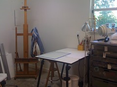
Studio, waiting for me


As I look forward to the start of the school year and the opportunity to get back into the studio I am considering this quote from the Incomplete Manifesto of Bruce Mau:

3. Process is more important than outcome
When the outcome drives the process we will only ever go to where we've already been. If process drives outcome we may not know where we’re going, but we will know we want to be there.

This also explains why over-thinking tends to kill an idea.

Over the next 5 months I aim to produce at least 50 paintings. I'm going to work smaller so that I can follow more ideas to completion and experiment more. I have no idea where I'm going to start and I am not letting myself think about it either - I don't want to make the ideas stale. But I expect a lot of experimenting with process and materials.

The studio is getting a 'summer clean' and a total rearrangement so I can have more wall space to hang works-in-progress and sketches. After visiting several artists' studios this year I got wall space envy!

Thursday, May 27, 2010

Joe Havel, sculptor, on art-making

Night by Joseph Havel, on display at the Baltic, Newcastle-upon-Tyne

photograph by paradasos on flickr


Joe Havel came to our critique class and gave each of us valuable feedback on our work. In the process, he addressed thoughts to all of us on art and art-making which I have summarized below. He has a clear, direct and energetic way of speaking, often referring to other art forms. He made several cross-art-form observations that gave his comments added depth to an avid reader and music lover like myself.

Making Decisions

Think about the vehicle you use (like a writer chooses a novel or a poem or a short story for what they want to say) and think about its history and your relationship to that history. Making art is about making decisions - about media, about vehicles, about our references. These individual decisions add up to our voice. Use all the tools you can to get specific about your choices and to give your work clarity. If something about your work isn't clear to others then you simply aren't doing it well enough. You may need to push it to the limits even more to get that clarity.

Never worry about style - worry about your meaning and your decisions. If those decisions come from a real place ((your intention and using your voice) then style will take care of itself.

Intellectual Platform

Educate yourself on the history and other practitioners in your area, e.g. portraiture, color field, print-making, it will not destroy your voice. By reading, writing and studying we build up an intellectual platform. The more you know the more you can conjecture and then the higher your platform gets. Why is this important? Because the higher your platform the more your conjecture becomes yours alone, the clearer your voice becomes. From a high platform you can simply see more interesting things.

Write about your work in order to gain clarity - what exactly do you mean by the statements you make about your art? What are you trying to achieve when you do this? Explain these paintings. Interesting art happens in communities because there has to be discussion and feedback that demands specificity and clarity.

Monday, May 24, 2010

Acrylic Gels and Mediums, part 1

Various Golden Acrylics

You go into the art supply store looking for a single color - to replenish your ultramarine perhaps - but walking along the aisle you are distracted by the jars and bottles, the shiny colors, the fluid colors... You leave the store three hours later with a bag full of goodies and a considerably lighter wallet.

How did that happen?

A month later most of those goodies still stand unopened in your studio.

There are a myriad of gels, mediums and additives for acrylic paint, not to mention all the specialty colors on top of the full color range. Where to start?

Tube Colors
Most people, whether coming from oils, or painting for the first time, start with the tube paints. These can be used 'as is' or diluted with water or acrylic mediums. I recommend having a damp brush and clean water to hand even if you use them straight from the tube because the rapid drying of acrylic paint can make them sticky and harder to brush in a matter of moments. For this reason, squeeze out a little at a time and/or use a "Stay Wet" type palette.

You will know when the paint is starting to become dry and sticky when you feel a resistance to your movement as the brush starts to drag in the paint. At this point stop brushing unless you want a lumpy mess for a paint surface!

Fluid Acrylics
These come in squirt bottles and have an intense pigment load so used as is they are very vivid. They are wonderful for mixing with glazing and matte mediums as they are a similar viscosity (more on all that below).

Open Acrylics
I haven't used these, but Golden (who make the OPEN acrylics) advertise them as extending the workable time of acrylics - that's the time you have to do any blending or brushing before the paint gets to that sticky stage I mentioned. If you use these please comment below - I would love to post your experience here (with a link to your blog or website).

Matte Medium
The most versatile and essential medium ever, in my opinion at least! It makes a great glue for collage or just sticking stuff into a sketchbook. Mixed with acrylic colors it dries with a matte surface. I have also used it to seal edges when taping. It is very fluid (about the same viscosity as thin cream) and mixes best with fluid acrylics, but can also be used with the tube colors - just add the medium bit by bit to the tube color. It dries with a very slight haze so be careful when layering it over other colors.

Glazing Medium
Glazing mediums come in all finishes, from glossy to satin, and are useful for thinning a color down to glaze. Why not simply thin the paint with water? Well, you can, but you have to be careful how far you thin with water. Too far and there is not enough binder (the acrylic base) to hold the pigment on the canvas. When you add Glazing medium you are adding more binder to hold the pigment glaze on the canvas. And yes, you can use water and glazing medium together. Glazing medium dries totally clear.

Adding either of the above mediums to your paint also extends the 'open' time - that is the time the paint is workable before stickiness sets in. Golden also have an OPEN acrylic medium (gloss) and an OPEN Thinner which can be used to extend that time even further.

Viscosity
Viscosity is basically the thickness of the paint - the tube paints have a high viscosity because thickeners are added, the fluid acrylics have a low viscosity. A thicker paint shows brush strokes more easily and can hold texture. There are lots of mediums that make thick paint even thicker but we will come to that another time...

In mixing paints of different viscosity, e.g. tube paint and matte medium, I have found that it is easier to start with the thick paint (in this case the tube paint) and gradually add the thinner paint or medium (the matte medium). Adding thick to thin only results in lumps that never seem to go away, get caught in my brush and appear where I least want them on the canvas! It's a bit like making a white sauce from scratch, adding the milk slowly bit by bit to the butter-flour mix.

More on some of the other gels and mediums available in an upcoming post. If you haven't checked out Golden's website you should - lots of good information there. They also have a great newsletter Just Paint with all kinds of articles about paint and color. I am not in the pay of Golden (sadly) - I just love using their paints. However, I did once work for a large manufacturer of acrylic emulsions (the raw binders and thickeners), as a chemical engineer on the acrylic plant, so I have some experience and background knowledge of the acrylic bases of these paints.

Now, get in your studio and dust a few mediums down! Let me know how you get on...


Sunday, May 2, 2010

Who let the Critic in?

Reflections


At some point, back in January, the Critic burst back into my life, making rude comments about working on computers and engineers being all black and white. Although a real person made those comments, and although they were not made about me personally, my nasty little Inner Critic got a great boost of inspiration and has been torturing me ever since. I'm not going to share what she says. If you have ever tried to do anything worthwhile you will have heard that voice - "It's no use", "You can't do it". Yep, knew you'd heard it.

As a result I haven't written many blog posts and I've become a true expert at Procrastination and Time Wasting. As of tonight I declare that OVER. Thanks to Charlie Gilkey's planners the next few weeks might see me moving forwards again.

Thursday, March 18, 2010

Going flat

These last few weeks I have been working on getting my paint surface 'just so'. I want even color with no visible brushstrokes, sharply defined edges between colors (especially when those colors are very similar) and a matte finish.
The matte surface can be taken care of at the varnishing stage but the rest (I suspect) is down to a mix of the paint, the brushes used, the painting surface and the brushwork itself.
So far I have been investigating the paint mix, testing every medium I could think of with fluid acrylic. All the paints and mediums I used are Golden acrylics.
Self-leveling medium was (unsurprisingly) the best at this but was also very hard to brush. Plus it is very glossy and would probably need several matte varnish coats to get an even matte-ness.
I tried a self-leveling/matte medium mix but rapidly lost the leveling nature.
The second best was GAC500, which Golden list as being for self leveling applications. It also dilutes fluid acrylics without changing their properties so it was very brush-able. I still got some brushwork ridges, but it was less sticky and viscous than self-leveling - much better to work with.

Of course, I could mask and spray, or roller, to get a brushstroke-free surface but I enjoy the moving meditation involved in this even, smooth brush painting. A painting equivalent of the hiker's "leave no trace" perhaps.

I used a transparent color (dioxazine purple) for all the trials and one thing became very clear: it is close to impossible to get a completely even coverage with a transparent color, whether I tape the edges or paint them freehand.


Thursday, February 11, 2010

Immediately and Imperfectly

Light and Shine

©2010 Caroline Roberts

I get Christine Kane's e-newletter and yesterday it was about procrastination. Since then these lines have been going around in my head:
"When I read Stephen King's book On Writing, I noticed something. I noticed that when Stephen King gets an idea, he writes it. Immediately and imperfectly."

So today, after an inspiring visit to Kia Neill's studio, I came home and played with a light and reflections diorama. It wasn't pretty (until the light shone on it), it's made from an old shoebox and a bunch of shiny stuff I have lying around. It took me five minutes to collect the materials together and about 15 very fun minutes to construct the diorama. I got my idea down and took 45 photos. No, it's not perfect and it's only a snippet of an idea, but I am pleased I did it. Now to do the same tomorrow!

Thursday, January 28, 2010

The computer as painting tool - an argument

Lost in the Forest (digital sketch)

©2010 Caroline Roberts

For some time an argument has been going on in my head between the two halves of my brain:

Left Brain: You can't use the computer to sketch with, that's Cheating.

right brain: Huh? But it's fun.

Left Brain (getting down a "Manual of Painting" full of checklists and rules): See here, Leonardo ground his own colors, Picasso used tube paints so I guess you can, but he definitely did not use a computer. He sketched. It's meant to be Hard Work.

(Left Brain really loves capitalizing things)

right brain: Yes, but didn't the Impressionists leap on the new chemical colors while the Paris Salons argued that it just wasn't right to have color in paintings instead of sludge brown? And you like the Impressionists right?

Left Brain (pouting): That's Different. Computers are Cheating. They're mechanical, not intuitive.

right brain: So, art should be intuitive but it has all these rules. Yeah... I'm going to work on the computer anyhow.

Two hours later...

right brain: See, this is cool, and fun, and totally intuitive. I did draw that, just with a digital pen and all that moving stuff around and adjusting things - that is not mechanical.

Left Brain (sulking now): It's Cheating.

right brain: I bet you think I should really be painting by candlelight in a dark cave with fingers and ground up dirt.

Left Brain: Now you're being sarcastic.

right brain: Yup.